

Custom Analytics (updated)
Build your own dashboards, called Liveboards, from your Spreedly payments and vault data.
Overview
Custom Analytics lets you build and share your own Liveboards on top of the same payments and vault data that powers Reporting and AI Analytics. The standard reports cover a fixed set of views. Custom Analytics lets you choose the measures, breakdowns, filters, and layout that matter to your team.
A Liveboard is an interactive dashboard made up of tiles. Each tile is a chart, table, or note. Liveboards query your data live rather than storing a snapshot, so anyone you share them with sees the same current view.
What data am I seeing?Custom Analytics shows data for every environment in your organization. To focus on one environment, add a filter on Environment Name or Environment Key.
Access requirements
- Custom Analytics must be enabled for your organization. Contact your Spreedly account manager or Spreedly Support to turn it on.
- Users need access to Reports. Anyone who can view the Reports section can open Custom Analytics. See Role-based access control (RBAC) and User Management.
- AI features require AI Analytics. Ask Spreedly, AI Highlights, Explore, Drill down, and Analyze with Spreedly AI appear only when your organization has opted in to AI Analytics in Organization Settings.
Open Custom Analytics
Select Custom Analytics in the left navigation, directly below Reports.
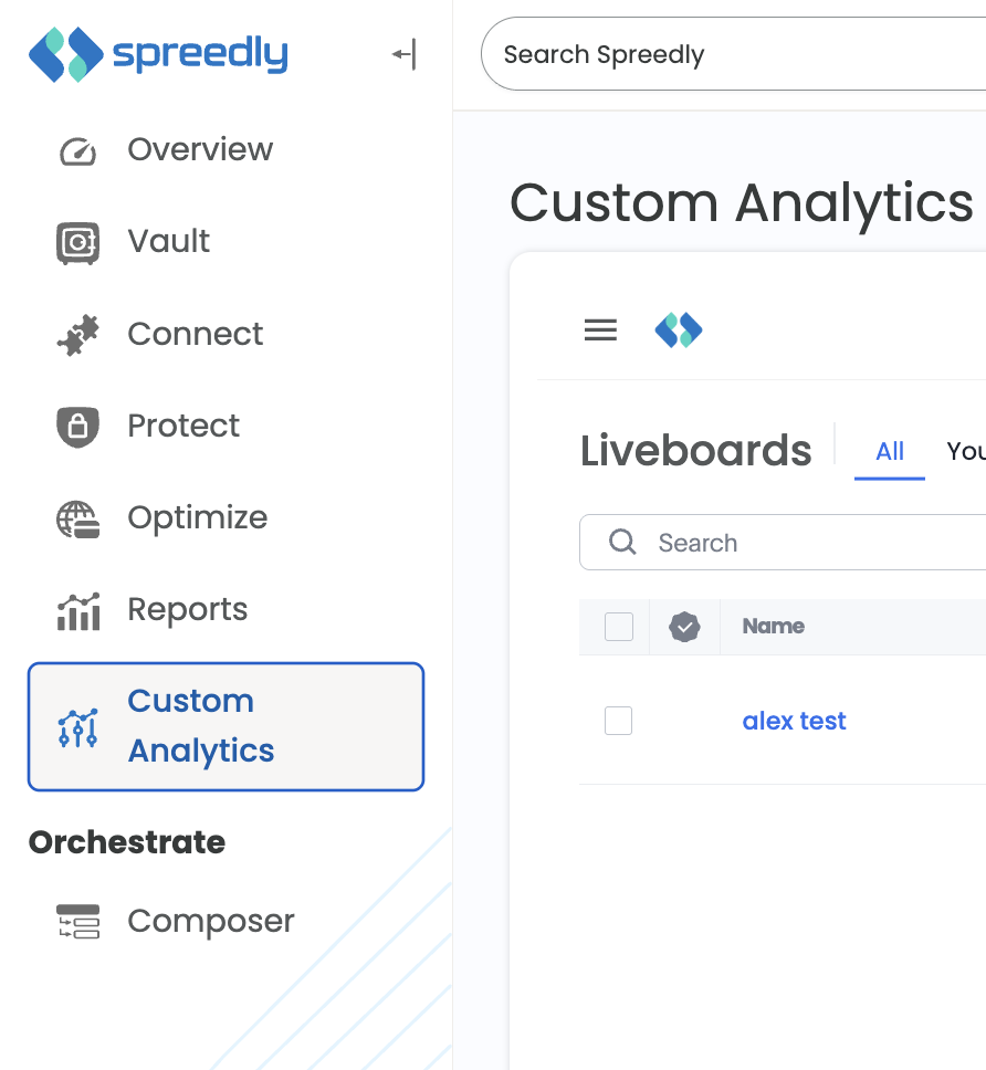
Custom Analytics in the left side navigation
Custom Analytics opens on the Liveboards list. Use the All and Yours tabs to switch between every Liveboard shared with you and the Liveboards you created. Use Search to find a Liveboard by name, and select the star to add one to your favorites.
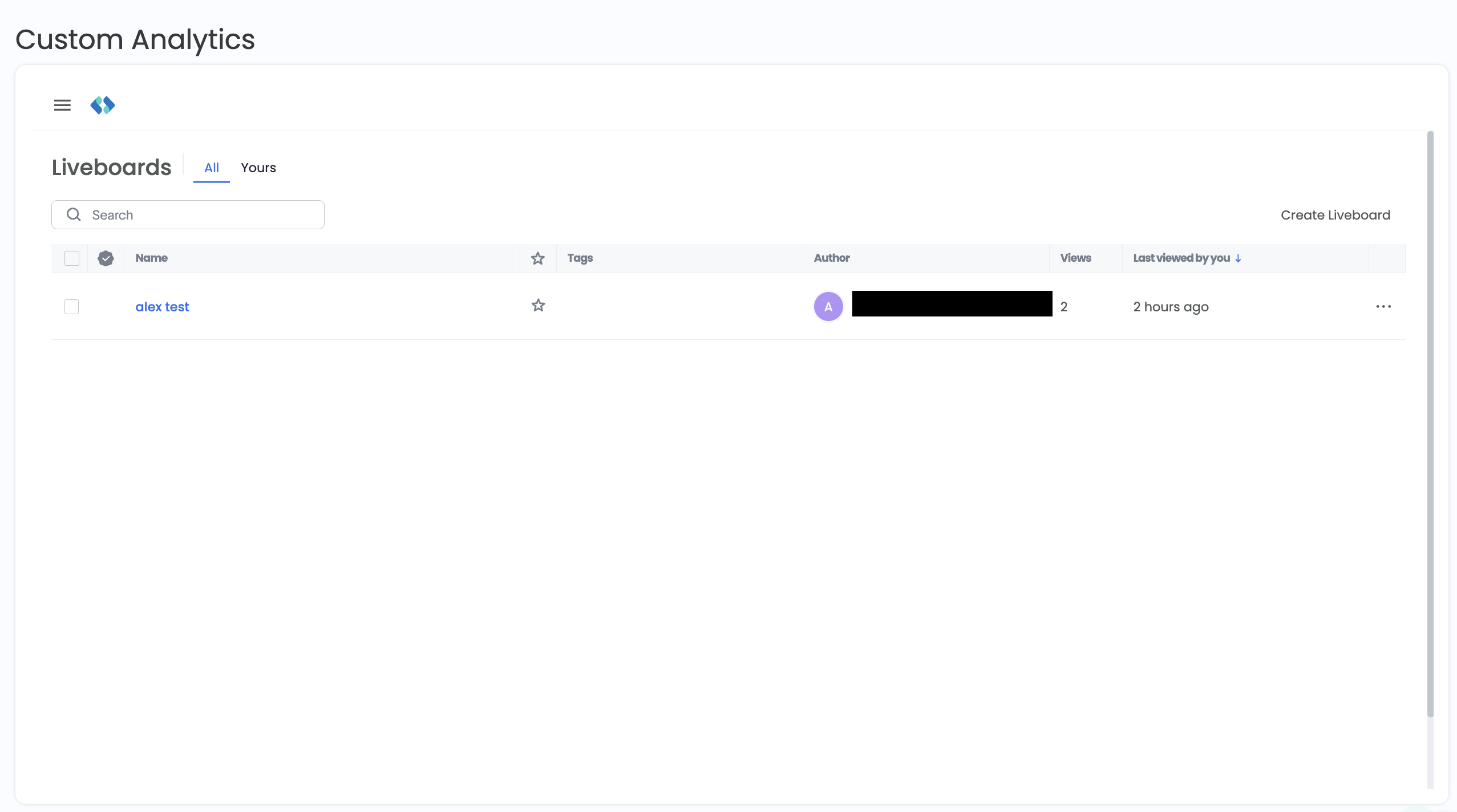
Liveboard list
Create a Liveboard
-
On the Liveboards list, select Create Liveboard.
-
In the Create new Liveboard dialog, enter a Name and, optionally, a Description that explains what the Liveboard is for.
-
Select Create.
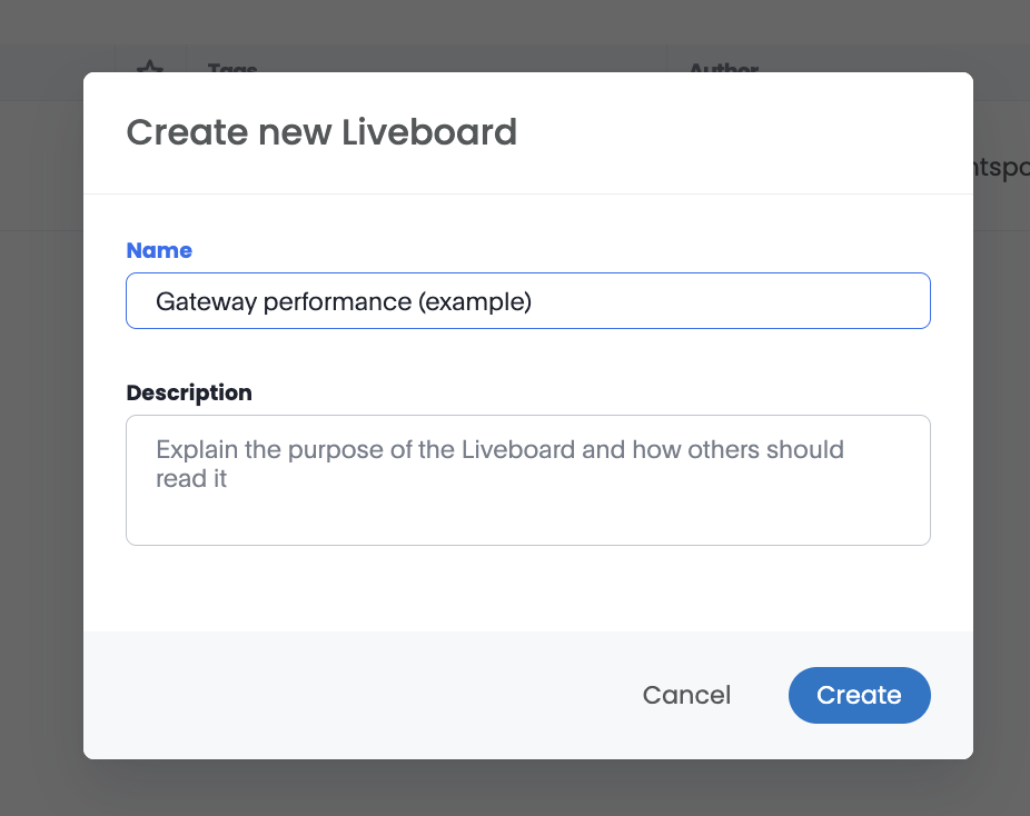
The Create new Liveboard dialog
Your new Liveboard opens empty, with a Search data button for adding your first visualization.
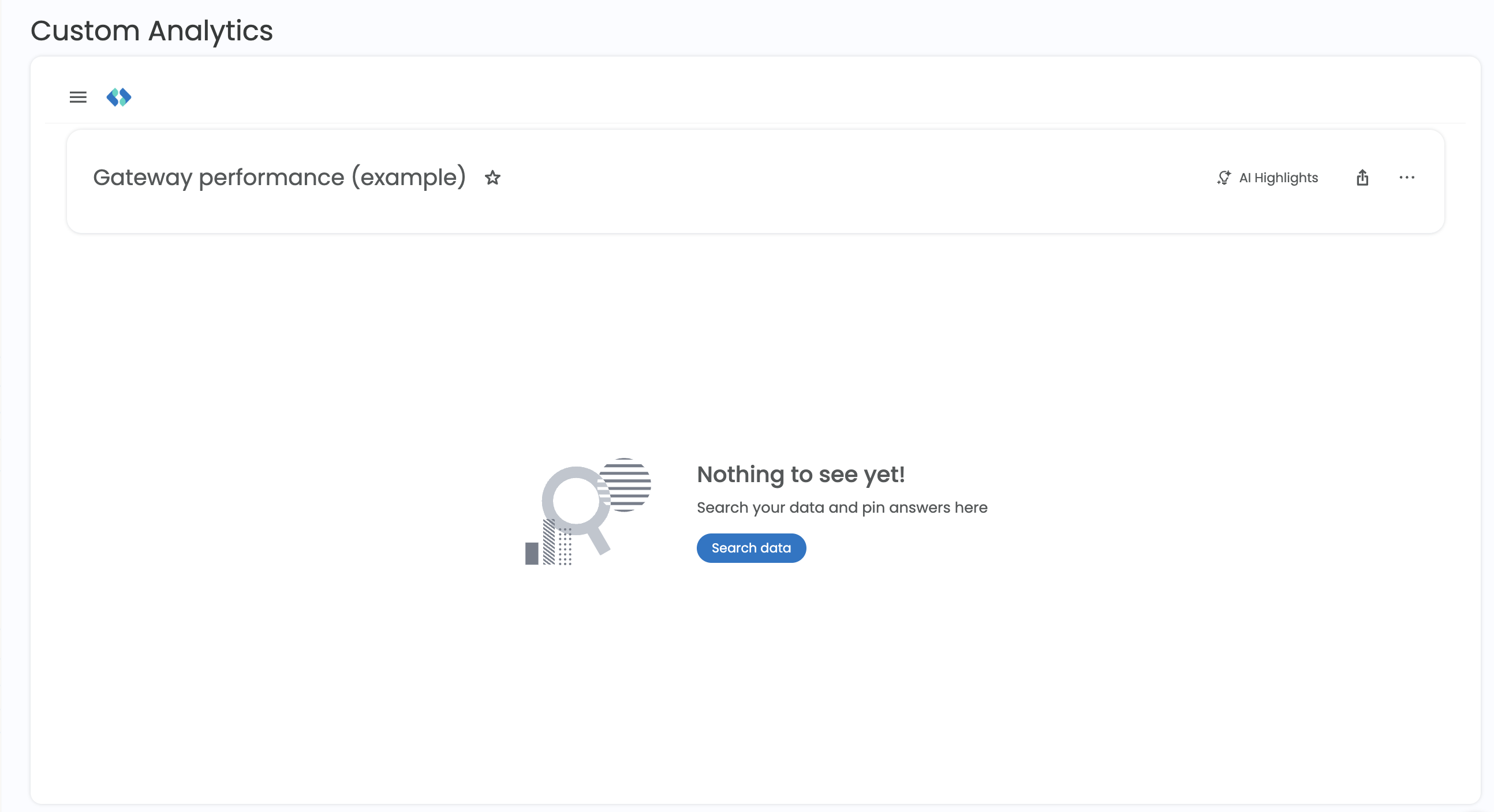
new empty Liveboard
Add visualizations
Visualizations are built from Spreedly's data models. You choose a data source, pick the columns to show, and select a chart type.
-
Select Search data.
-
Select the data source to build from. Use the payments model for transaction data such as success rates, decline reasons, and gateway performance, and the vault model for payment method data.
-
Add columns from the data panel on the left. Select an attribute to group by, such as Gateway Type, and a measure, such as Success rate. The chart updates as you add columns.
-
To narrow the results, add a filter to the visualization, for example limiting a date column to the last 30 days.
-
To change how the data is displayed, open the chart type picker and select a chart, such as a bar chart, line chart, or table.
-
Select Pin, choose your Liveboard, and select the tab to add the visualization to.
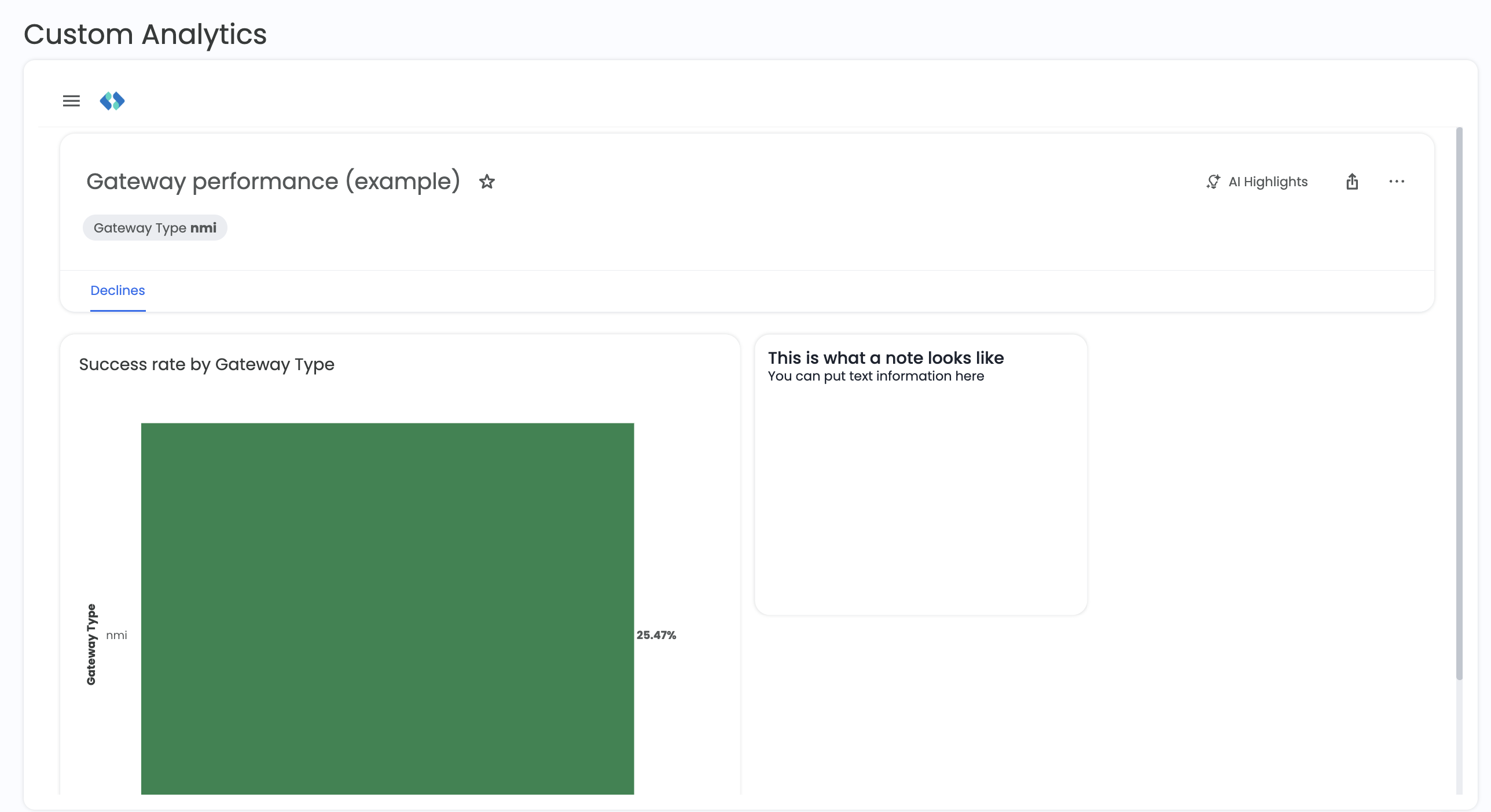
A liveboard with visualization and a note
Edit a Liveboard
To change a Liveboard's layout, tabs, notes, or filters, open the More menu (⋯) in the Liveboard header and select Edit. When you're done, select Save to keep your changes or Cancel to discard them.
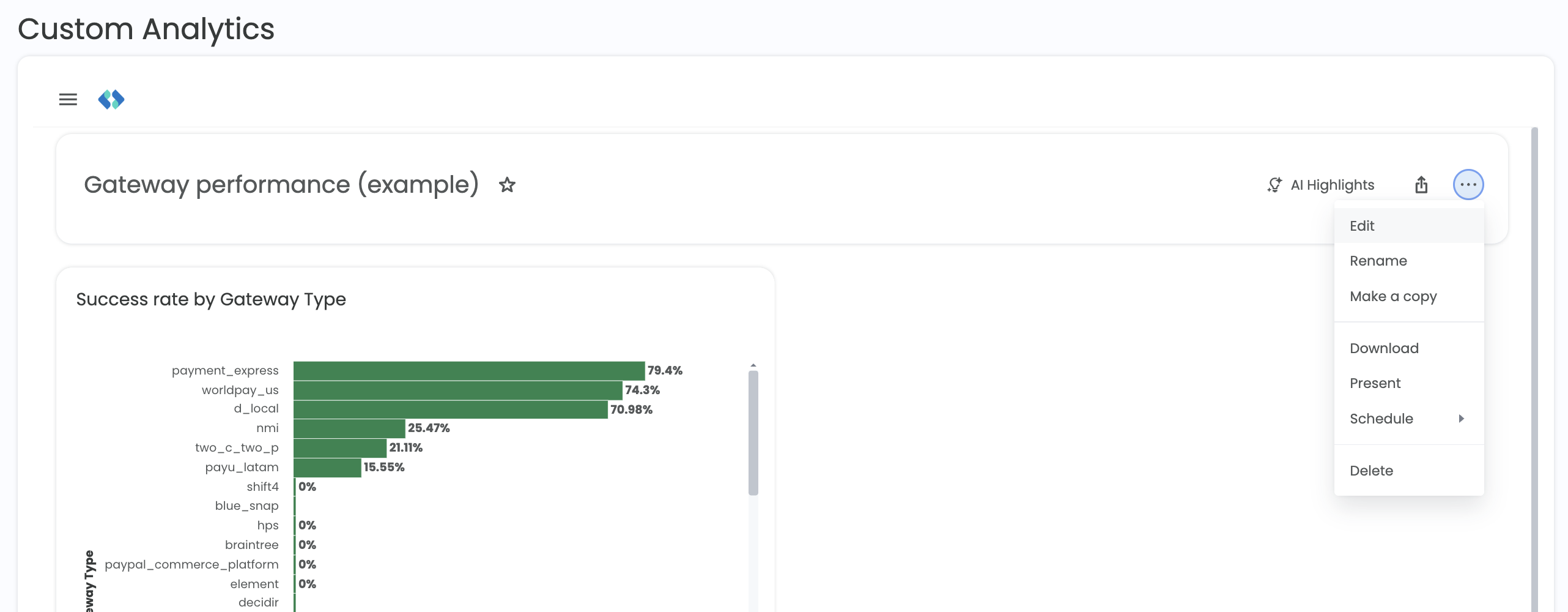
The Liveboard More menu
In edit mode, the toolbar at the top of the Liveboard shows Add tab, Add note, and Add filter. You can also select Add description under the Liveboard name or any tile title to describe it.
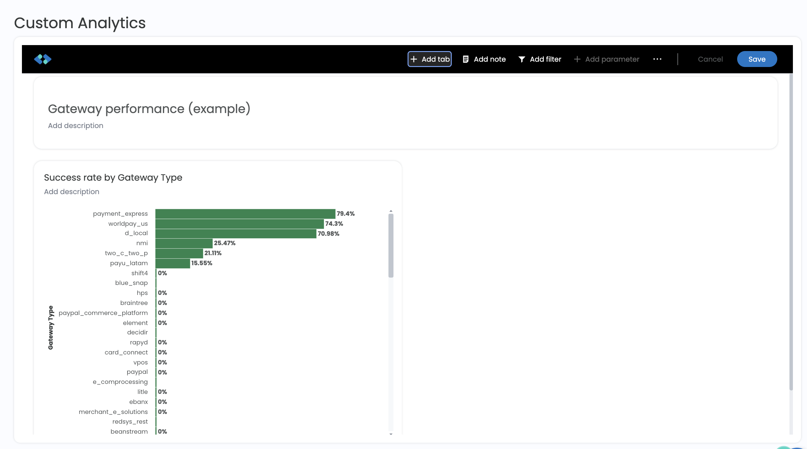
A liveboard in edit more
Arrange and resize tiles
- Move a tile: drag it by the handle (::::) at the top of the tile.
- Resize a tile: open the tile's ⋯ menu and select one of the size options, or drag the tile's bottom-right corner.
- Remove a tile: open the tile's ⋯ menu and select Delete.

The size options on a Liveboard
Organize with tabs
Tabs group related visualizations on one Liveboard, such as a tab for success rates and another for declines.
-
In edit mode, select Add tab.
-
Enter a name for the tab.
-
To rename, reorder, or delete a tab, open the menu next to the tab name.
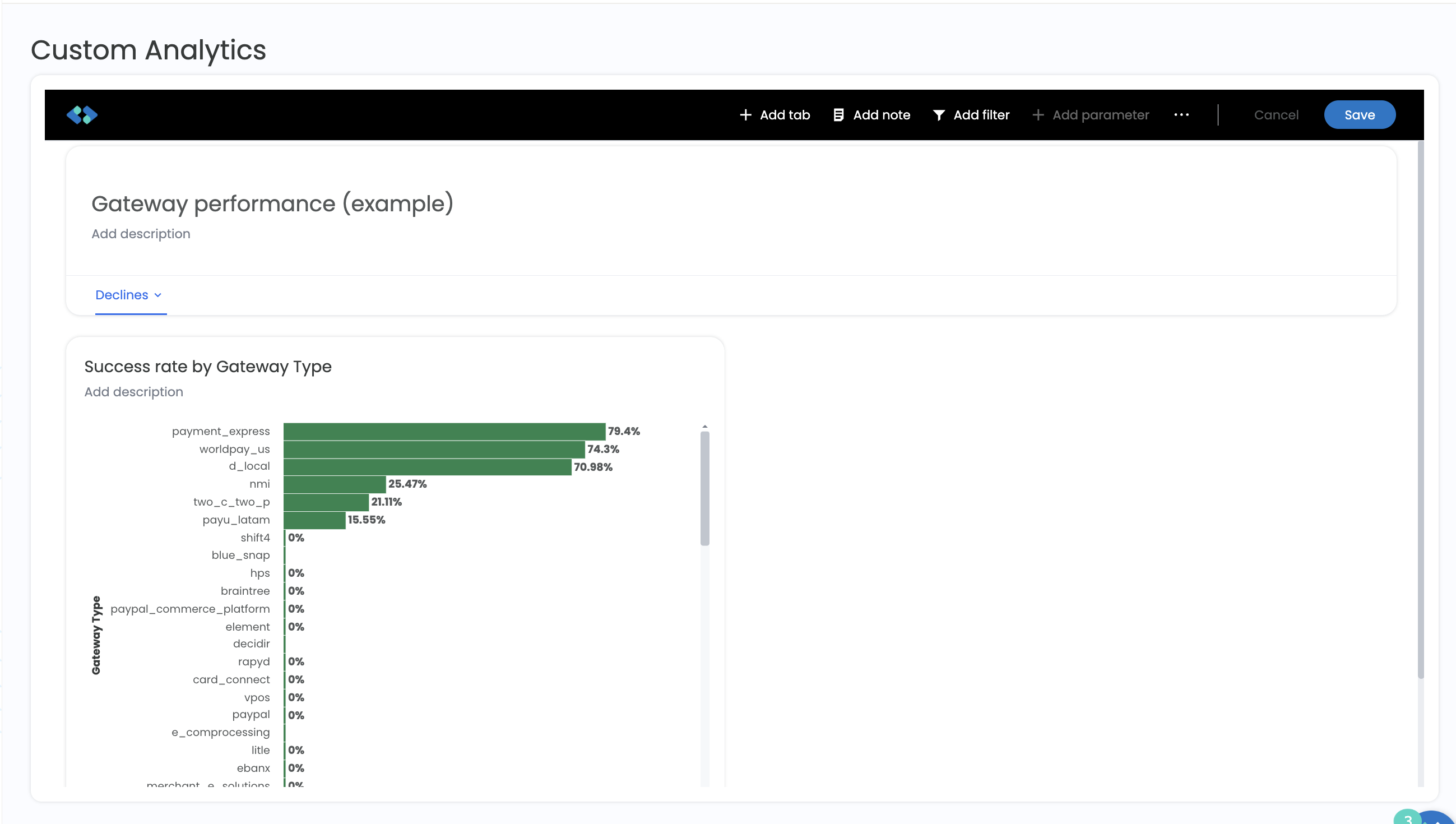
A Liveboard with a tab called 'Declines'
Add notes
Notes add context to a Liveboard, such as what a chart measures or who to contact with questions.
-
In edit mode, select Add note.
-
Type your text. Use the formatting toolbar to change the text style, add bold or italics, insert links, and more.
-
Drag the note to where you want it.
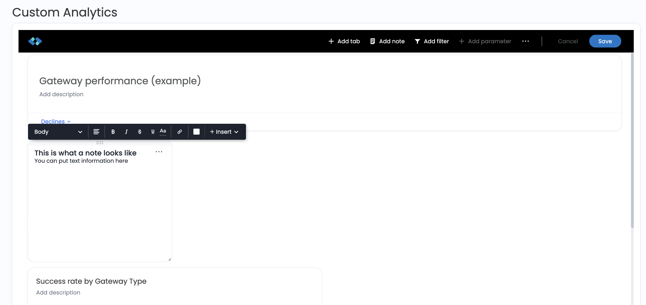
A Liveboard with a note
Add filters
Liveboard filters apply to every visualization on the Liveboard, or to the tabs and visualizations you choose.
-
In edit mode, select Add filter.
-
In the Add Filters panel, search for or select a column, such as Gateway Type, Environment Name, or Currency.
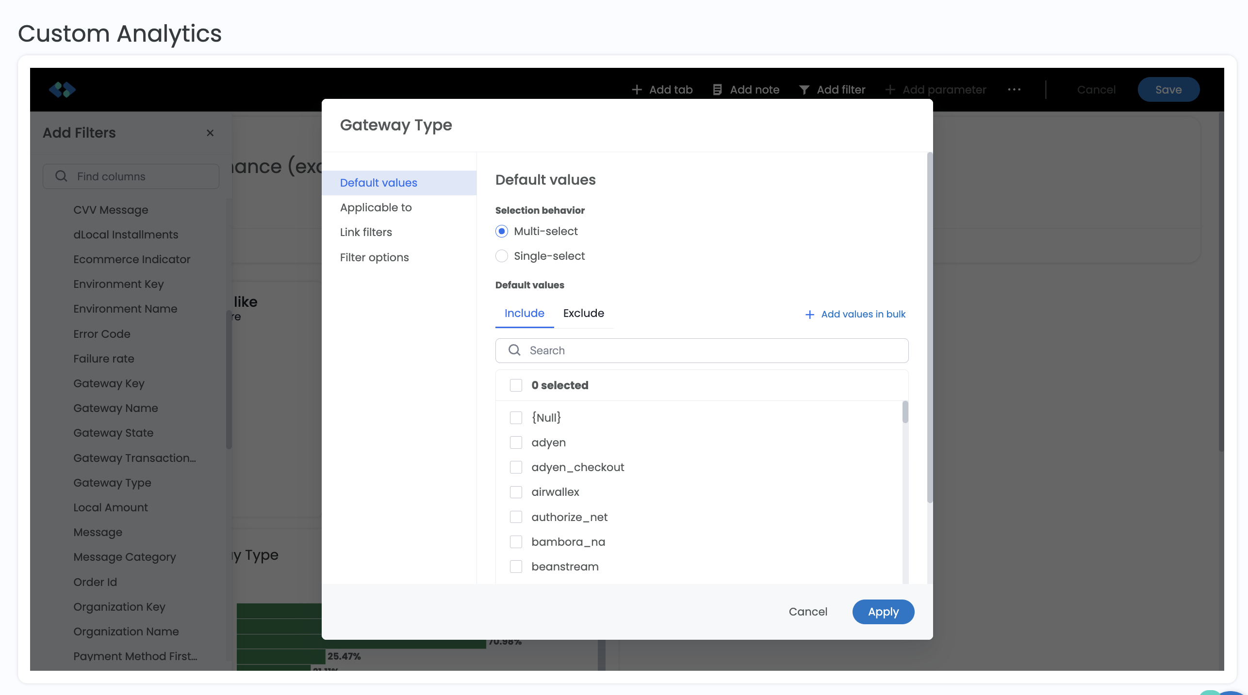
Choosing a column to filter on
-
Under Default values, choose Multi-select or Single-select, then select the values to Include or Exclude. Use Add values in bulk to paste a list of values.
-
Optionally, use Applicable to to limit the filter to specific tabs or visualizations.
-
Select Apply.
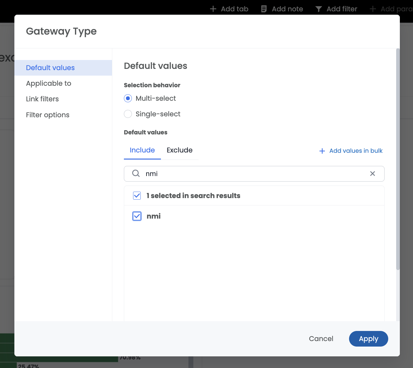
Selecting a filter value
-
The filter appears under the Liveboard name. Select Save to keep it.
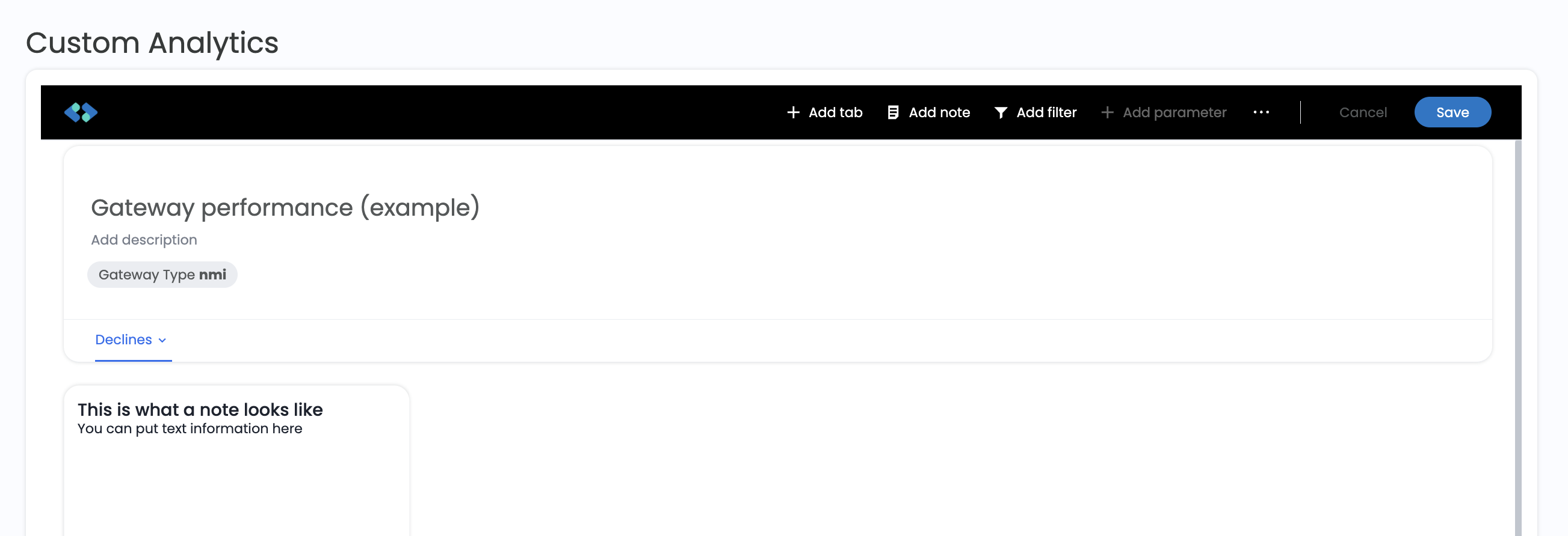
An applied Liveboard filter
Explore your data
Outside of edit mode, every visualization is interactive.
Each tile's ⋯ menu includes:
- Edit, Rename, Make a copy, and Pin to change the visualization or reuse it on another Liveboard
- Explore to investigate the data behind a visualization without changing the Liveboard
- Show underlying data to see the rows behind the chart
- Download to export the visualization
- Present to show the visualization full screen
- Analyze with Spreedly AI to have Spreedly AI look for trends and outliers in the data
Select Ask Spreedly on a tile to ask a question about that visualization in plain language.
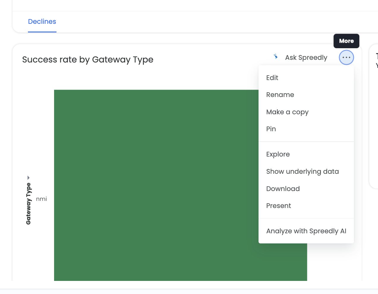
The Visualization menu
Right-click a data point, such as a single bar, to Filter on that value, Drill down into it by another column, Show underlying data, or Analyze with Spreedly AI.
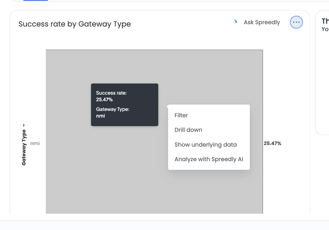
Right-click options on a data point
Select AI Highlights in the Liveboard header for an AI-generated summary of notable changes across the Liveboard.
Share a Liveboard
-
Select the share icon in the Liveboard header.
-
Enter a user name or group name.
-
Leave Send notification checked to email the people you share with, and optionally select Add message (optional) to include a note.
-
Select Share.
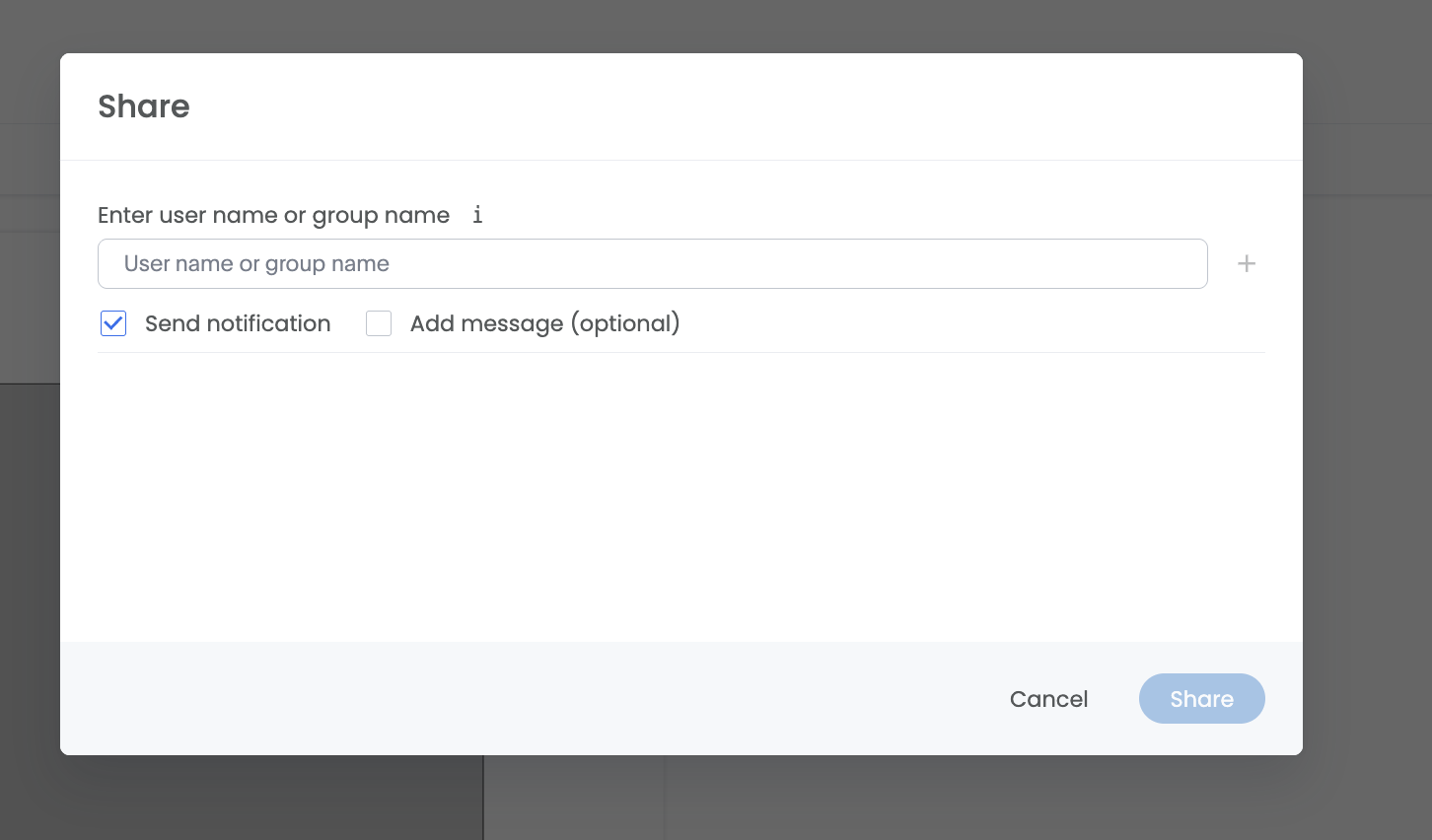
The Share dialog
Liveboard actions
The More menu (⋯) in the Liveboard header contains these actions:
| Action | What it does |
|---|---|
| Edit | Opens edit mode. See Edit a Liveboard. |
| Rename | Changes the Liveboard name and description. |
| Make a copy | Creates a copy of the Liveboard that you own. |
| Download | Downloads the Liveboard or individual visualizations. |
| Present | Shows the Liveboard full screen. |
| Schedule | Emails the Liveboard on a recurring schedule. |
| Delete | Permanently deletes the Liveboard. |
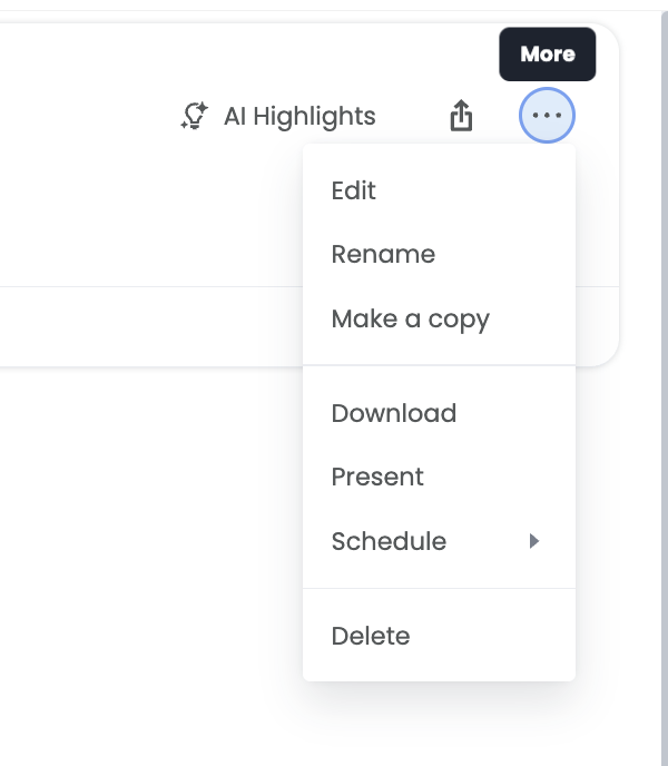
Liveboard More menu
Schedule a Liveboard
-
Open the More menu, then select Schedule and create a new schedule.
-
Under Set up schedule, enter a Schedule name and choose how often to send it under Send every, including the time, days, and time zone.
-
Optionally, select Add gating condition to send the Liveboard only when a condition is met.
-
Under Select attachment type, choose the file format, such as PDF.
-
Under Add recipients, add the people who should receive it.
-
Optionally, under Views, choose a saved view of the Liveboard to send.
-
Select Create. To send the Liveboard once right away, select Send now.
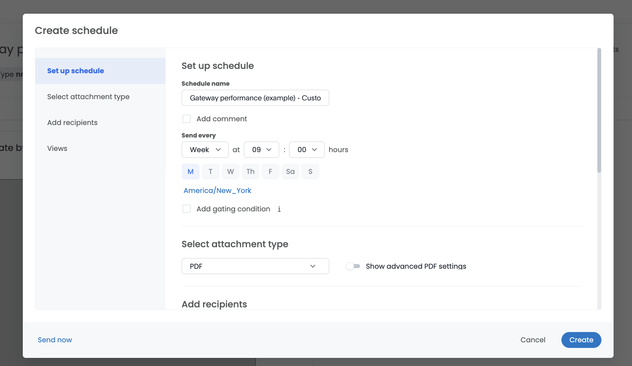
Creating a schedule
Download a Liveboard
- Open the More menu and select Download.
- Choose the file type, such as PDF.
- Choose whether to download the whole Liveboard or individual Visualizations, the Layout, and which tabs to include.
- Select Download.
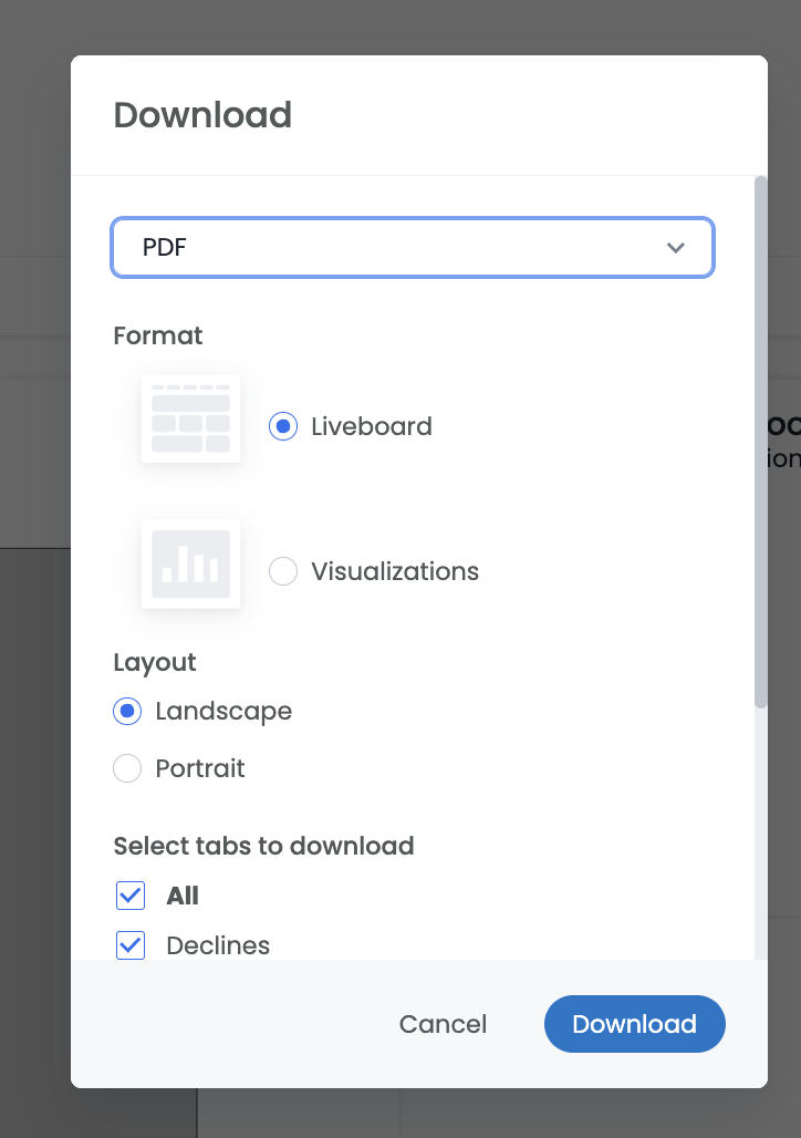
the Download dialog
Make a copy
To start a new Liveboard from an existing one, open the More menu and select Make a copy. Enter a Name and Description, then select Save. Copying is a good way to adapt a Liveboard someone shared with you without changing the original.
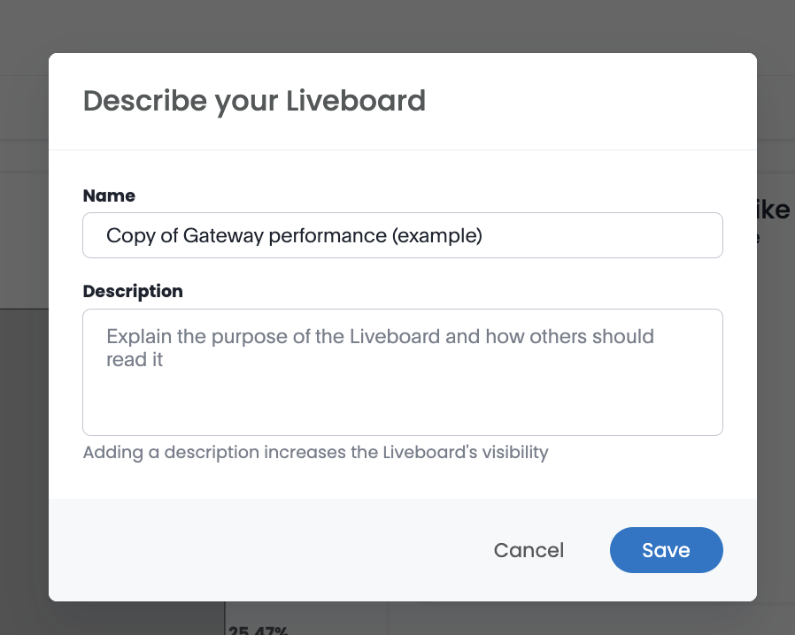
Making a copy of a liveboard
Save a personalized view
You can change filter values on a Liveboard you're viewing without editing it. To keep those filter values for later, save them as a view.
-
Change one or more filter values on the Liveboard.
-
Select Save view.
-
Enter a Name for the view.
-
To share the view with everyone who can access the Liveboard, select Make view available to everyone with access to this Liveboard.
-
Select Save.
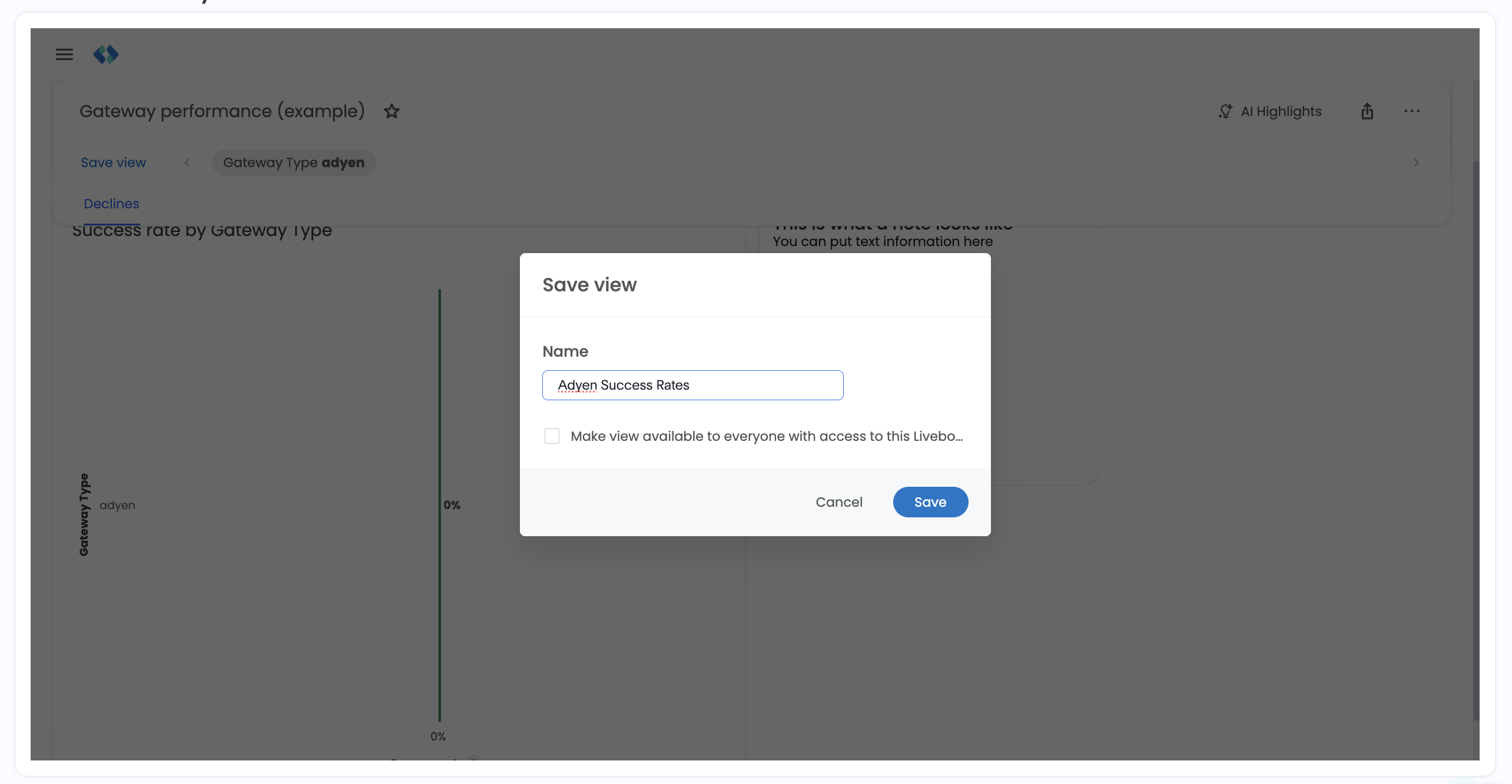
Saving a personalized view
FAQs
What's the difference between Custom Analytics and Reports?
Reports are standard views that Spreedly maintains for every organization. Custom Analytics lets you build your own Liveboards from the same data, choosing the measures, breakdowns, and filters that fit your team.
Who can see my Liveboard?
A new Liveboard is visible only to you until you share it. Use the share icon to give other users or groups access.
Why don't I see Explore, Drill down, or Ask Spreedly?
These features require your organization to opt in to AI Analytics. An organization admin can opt in from Organization Settings.
Can I see data from all of my environments?
Yes. Custom Analytics includes data from every environment in your organization. Add a filter on Environment Name or Environment Key to focus on one environment.
Updated about 2 hours ago